Elixir Koffucha
A fizzy caffeinated drink with natural probiotics. A version of kombucha that’s made out of coffee rather than tea.
A fizzy caffeinated drink with natural probiotics. A version of kombucha that’s made out of coffee rather than tea.


This was my initial design for the project. Labelled are all the important aspects of a product label and the most basic design.

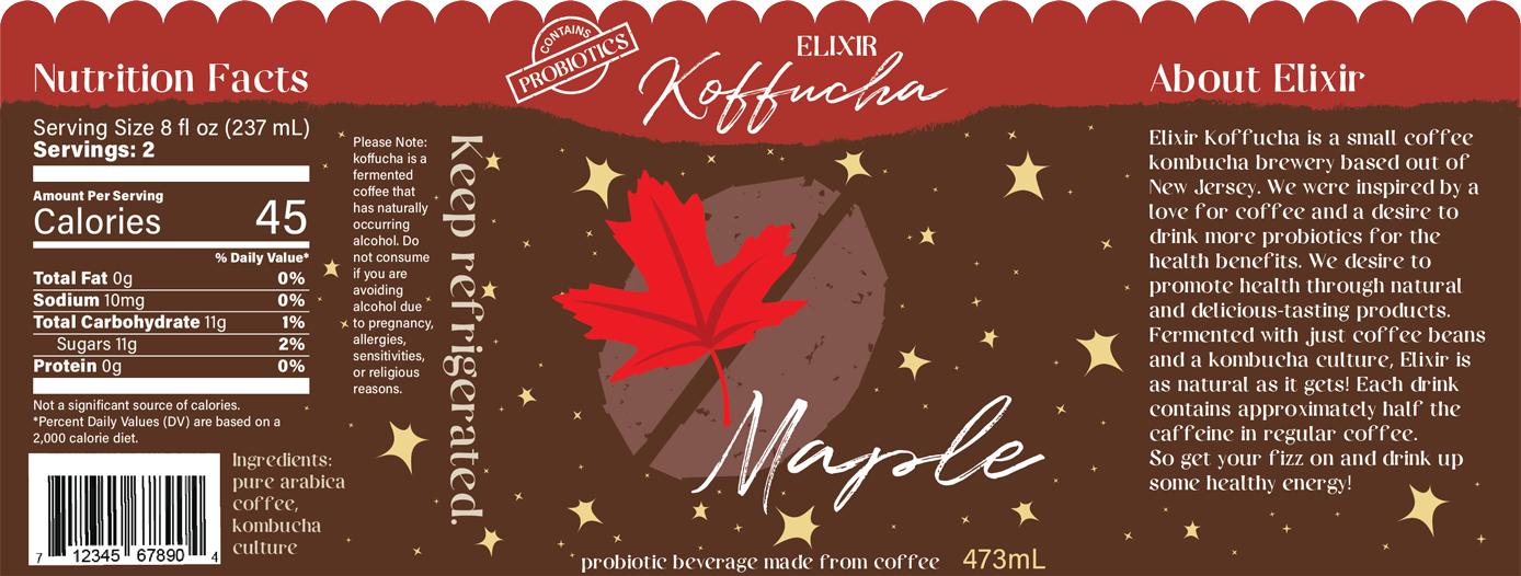
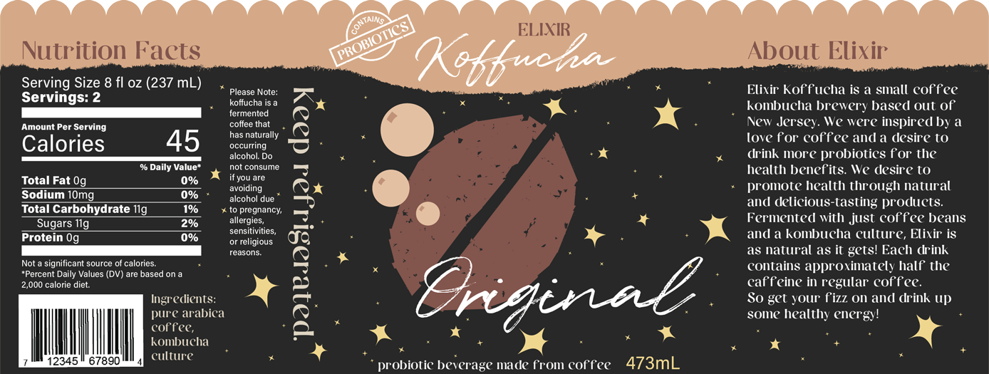
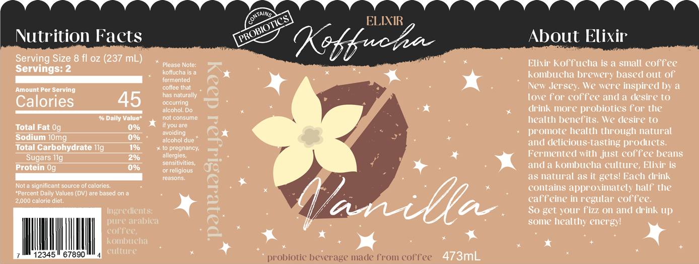
The coffee bean was an important element to my brand, as I wanted to create something simplistic and recognizable that also felt natural. This effect was achieved by layering patterns on top of the design and applying the roughen effect.

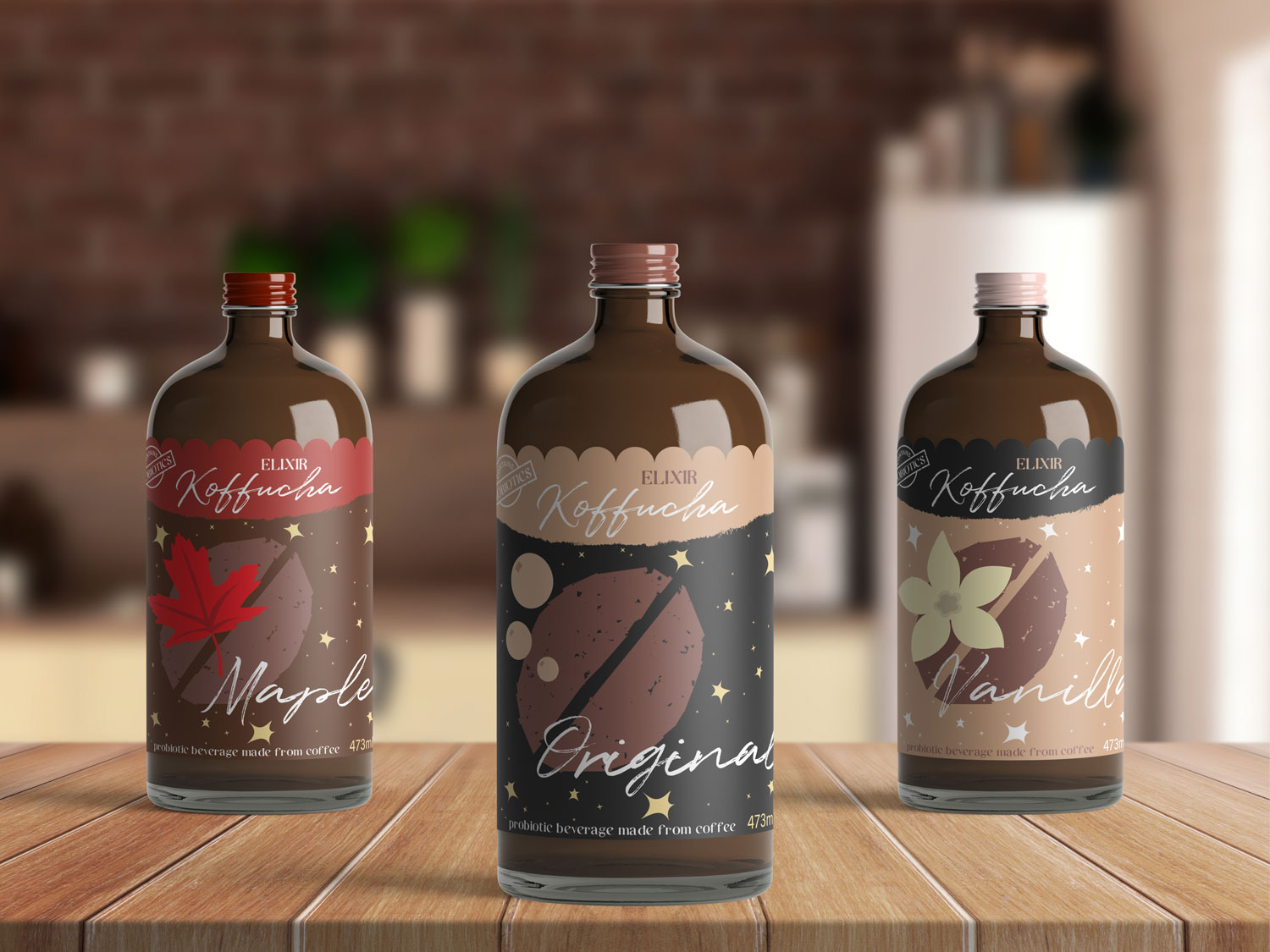
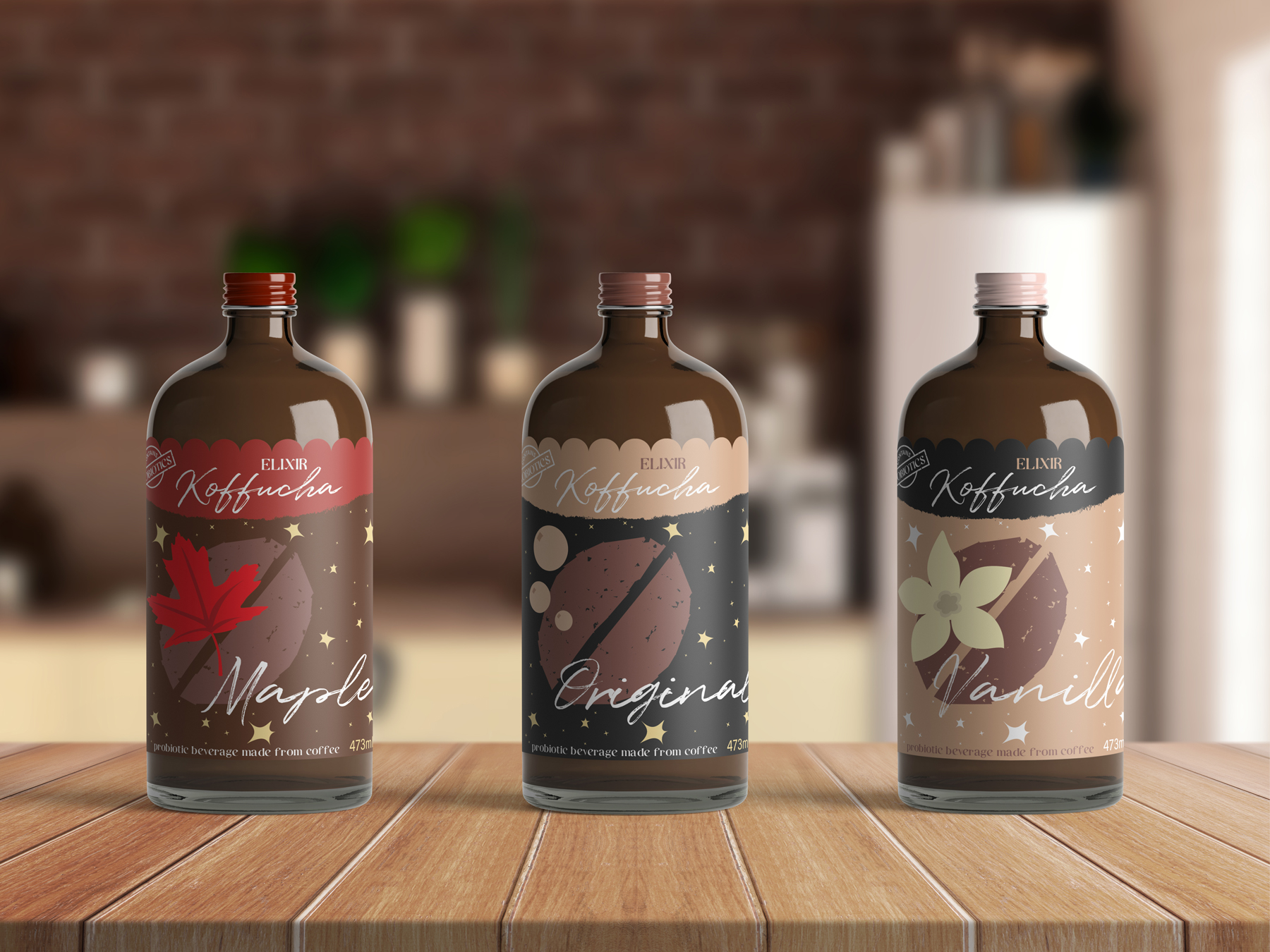
Within a brand, each different flavor must be differentiable in some way. Sometimes it's a simple word stating the flavor, but more often not, the color palette and imagery on the label changes. I wanted each of my three flavors–Original, Vanilla, and Maple–to have distinct color palettes that looked the way the flavor tasted.
While the color palettes look roughly the same with a few different colors brought in here and there, when different amounts of each color are applied, they create very distinct experiences.

I wanted to incorporate recognizable iconography into my flavor labels. Therefore, to denote the Vanilla and Maple flavors, I brought in illustrations of the Vanilla flower and Maple leaf. The original label didn't fit in with the rest by not having an icon, so I created some bubbles, as koffucha is a naturally carbonated beverage. The simple, clean illustration style ties in with the rest of the label designs. Each label maintains the coffee bean, as they are all a coffee-based product.


While my initial design was a good starting point, it needed some refinement. My major changes included:
My initial color palette wasn’t quite as warm or vibrant as I wanted it to be, so I transformed the color palette a bit. In some places, contrast issues with text were fixed to improve readability.
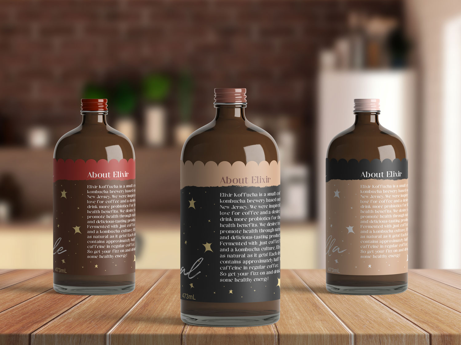
The scalloped top edge of the label and the paintbrush-style line underneath the brand name both serve to emphasize that the brand is natural, homey, and authentic. It also adds visual interest to the design and distinguishes it from its competition.
My text size was too small for the label in some places, and the main image was too small. Once people recognize the brand, they’d want to be able to grab their preferred flavor quickly and easily, and fixing the sizing solves this issue.
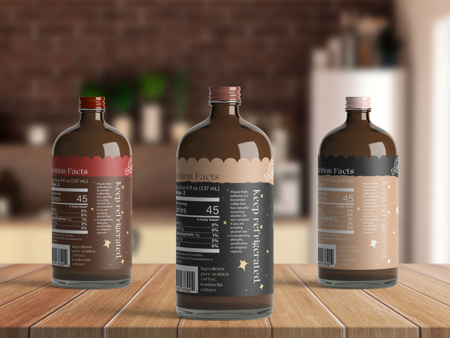
My label was missing the warning about naturally occurring alcohol, and I changed the Ingredients label to fit standard practices. I also included a “contains probiotics” icon at the top of the label, as that’s one of the main benefits of the drink.