I've been baking sourdough bread for a year and a half, and with the pandemic, the sourdough craze has blown up! Sourdough has definitely become a "much kneaded" staple to many of our lives, bringing us tasty food and a calming activity.
Thanks to a bag of flour, a jar, and the natural yeast in the air, I can now bake everything with a bit of culture–from baguettes to english muffins to the most delectable cardamom buns I've ever tasted!
This project came as a way to accelerate that process. New bakers often struggle to find a recipe that works, understand the lingo, and sometimes want a jump start with a bit of active starter. This kit includes all the necessities, minus a few that people probably already have in their home or plan to buy, such as a baking vessel.
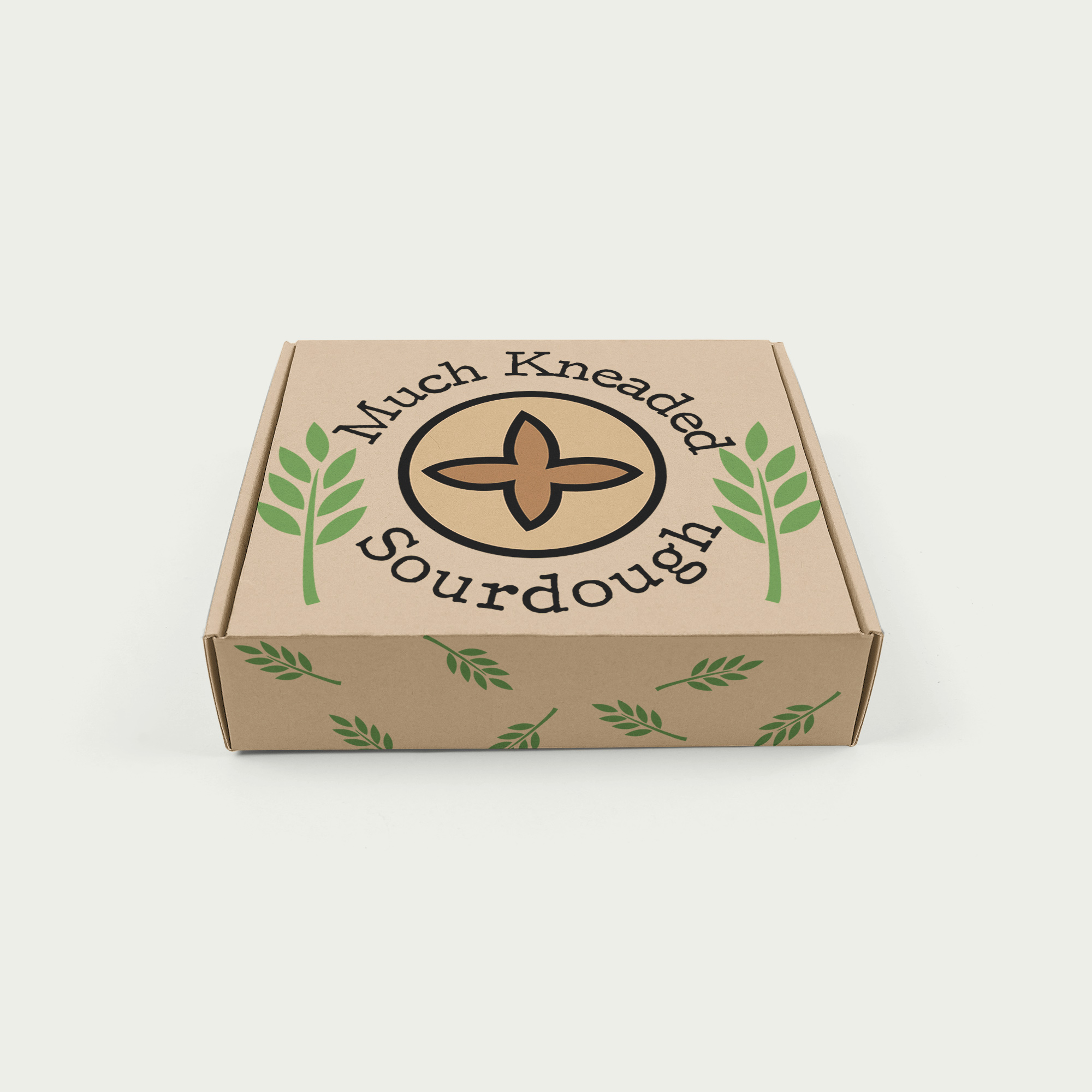
My initial design ideas for the logo contained a variety of imagery, from the actual bubbly starter itself to wheat stalks–a common design scored onto sourdough–to a boule of bread.
By turning the outlines of the logo into brush-strokes, I was able to create a more natural element that would lean itself towards creating a cohesive, organic feeling that matches the product.
Black logo for use on light-colored backgrounds.
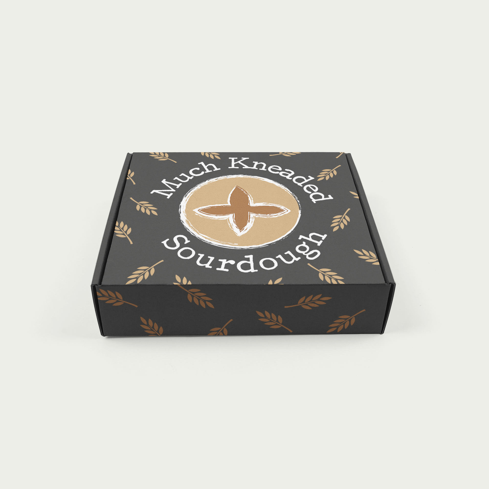
White logo for use on dark-colored backgrounds.
Simplified logo for usage as a stamp or in smaller locations.

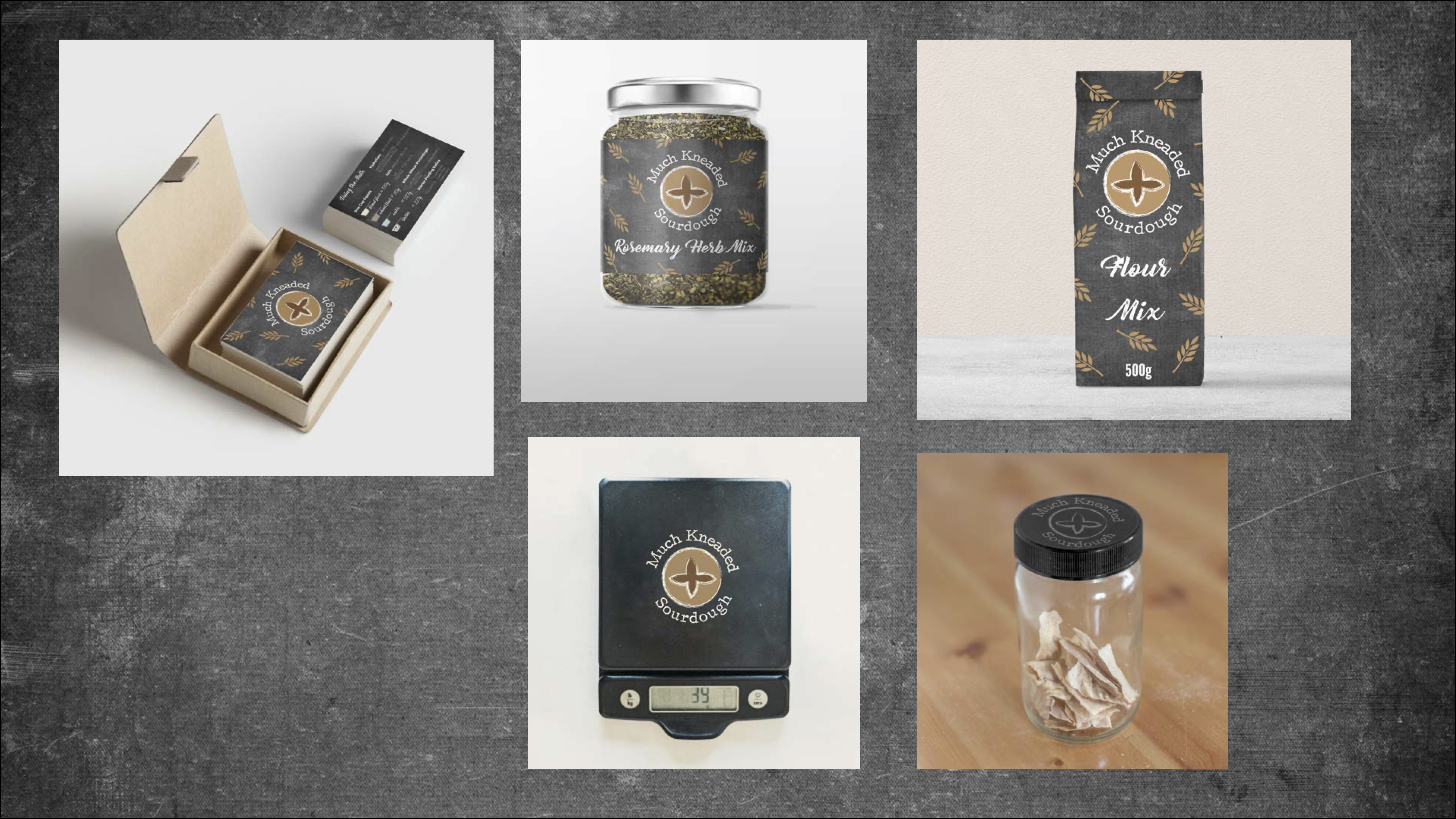
Initially, my designs weren't matching up. I knew where I wanted the cards to go, but the rest of my packaging was all over the place. Using my cards as a starting point, I created a cohesive brand using the same flour-on-black background and wheat stalks.
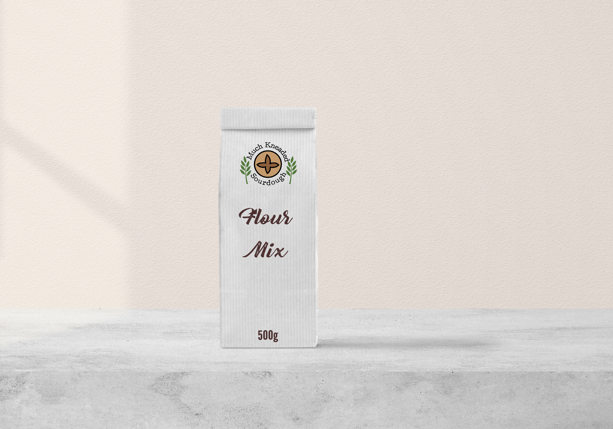
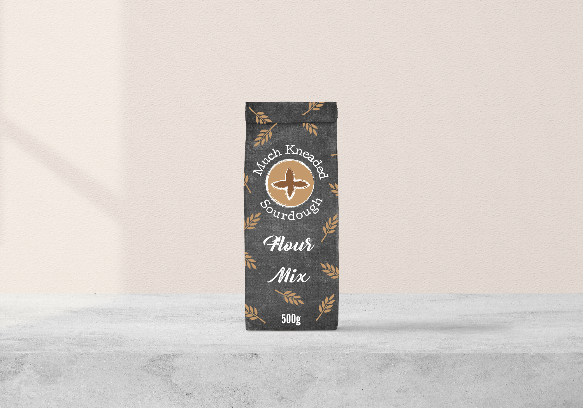
This flour includes all you need to maintain good starter health. The design started off boring with a white background. Even when I tried adding a burlap texture and some wheat stalks, it failed to look cohesive. Finally, I added the chalk-texture background and some random wheat stalks.
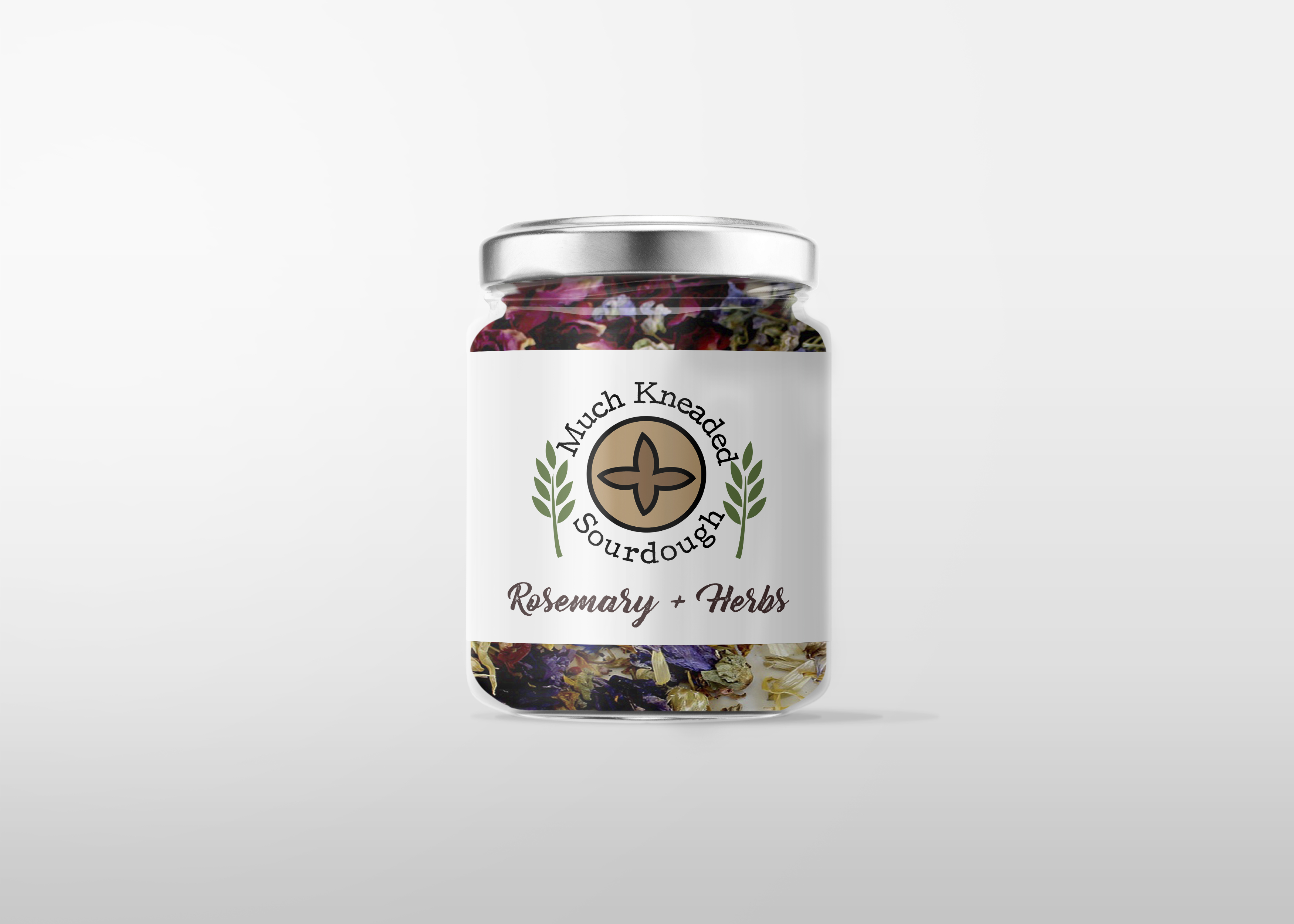
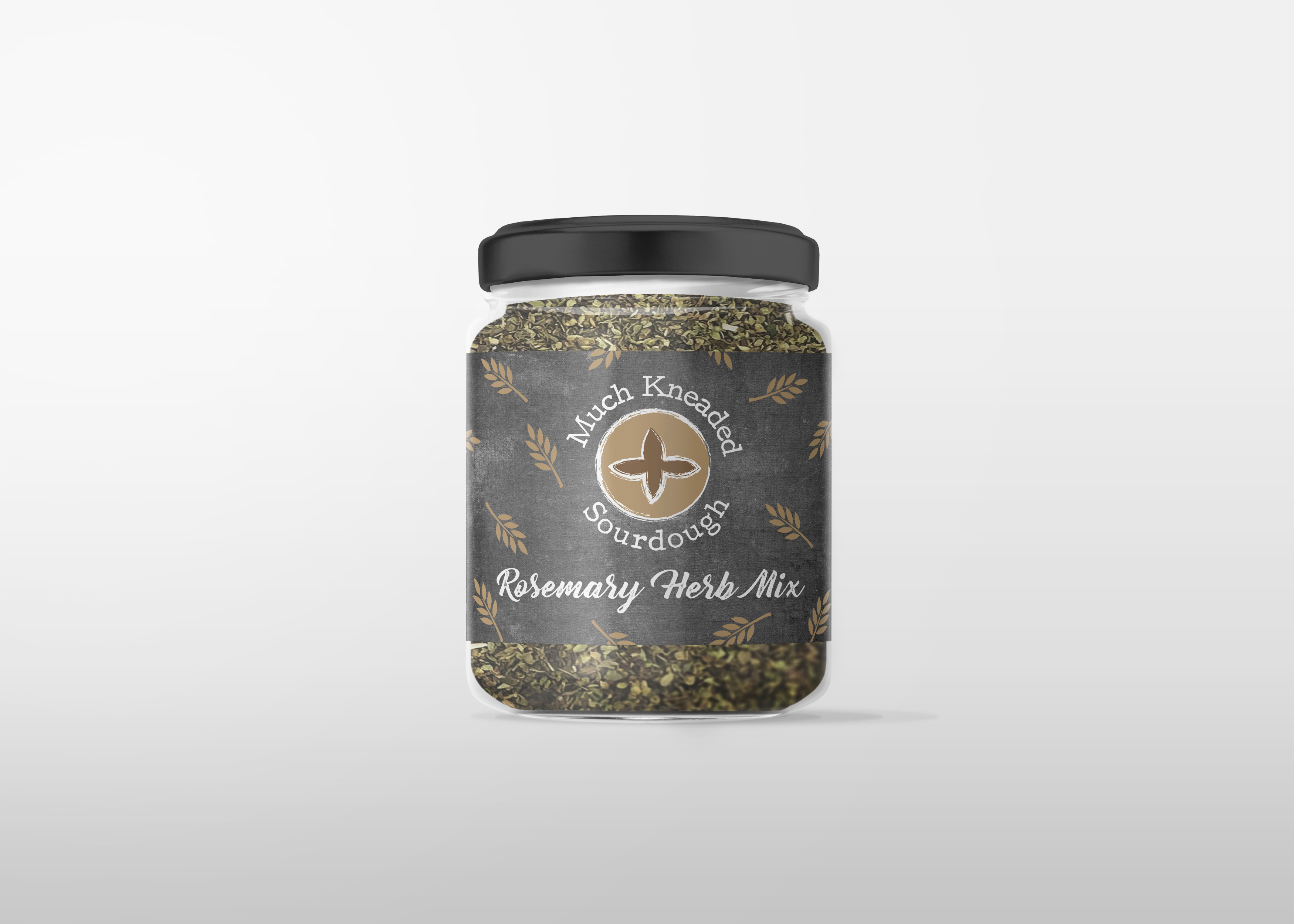
The jar contains herbs to inspire consumers to be creative with their bread-baking! Similarly to the flour container, the plain background just wasn't cutting it. Plus, the green-colored wheat stalks were more reminiscent of gardening than baking. Once they were changed to a golden-brown and the background was changed, it matched the rest of the designs.
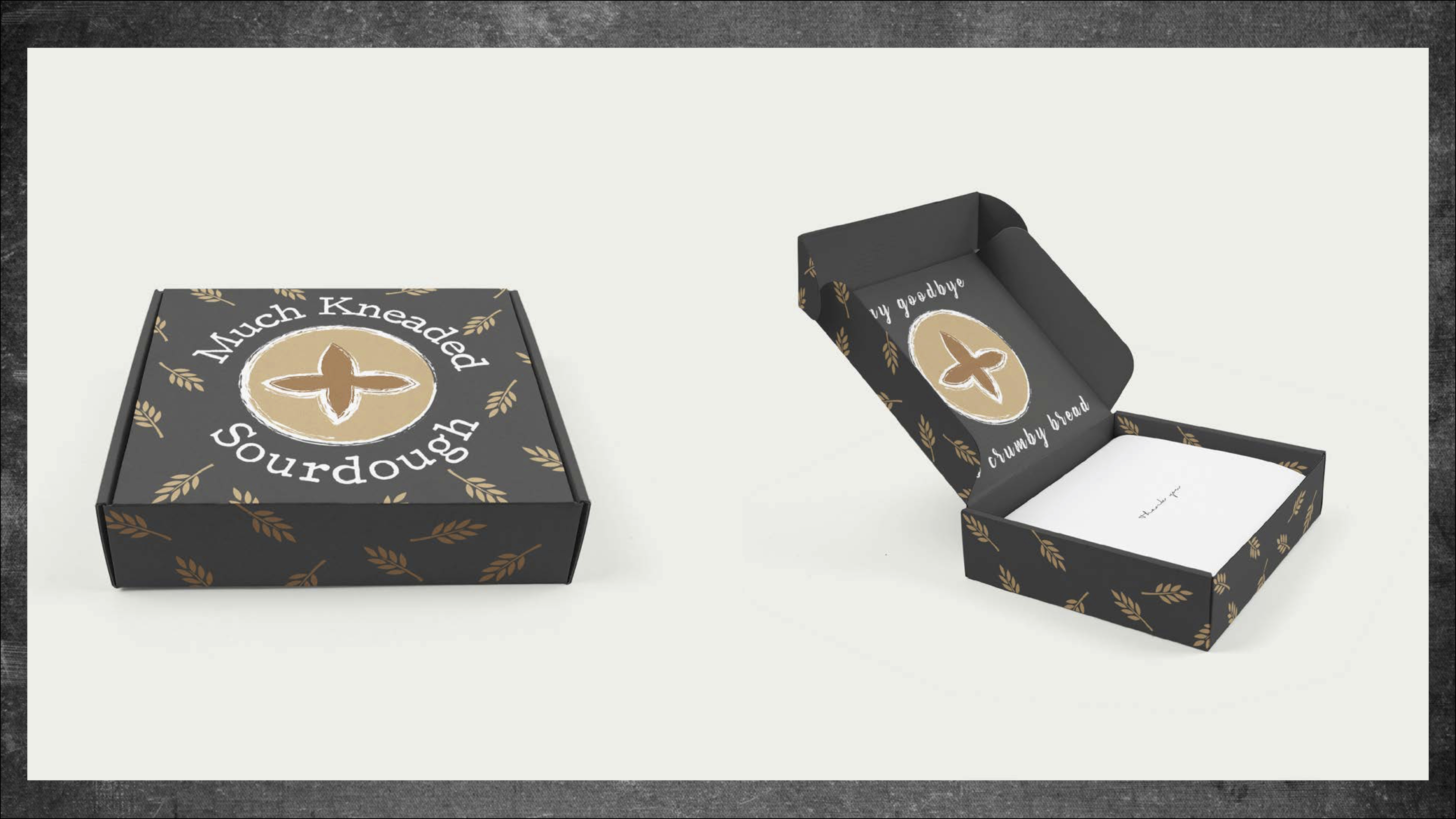
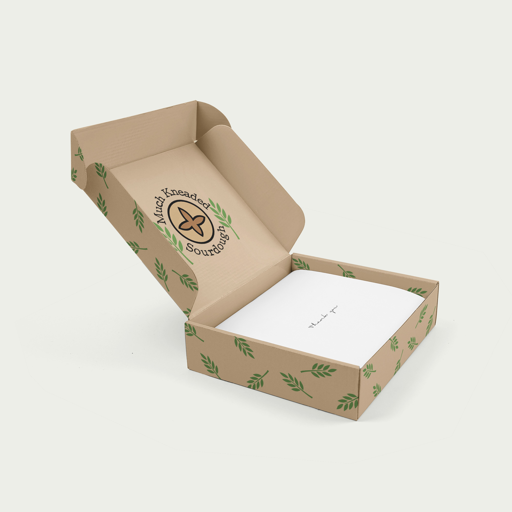
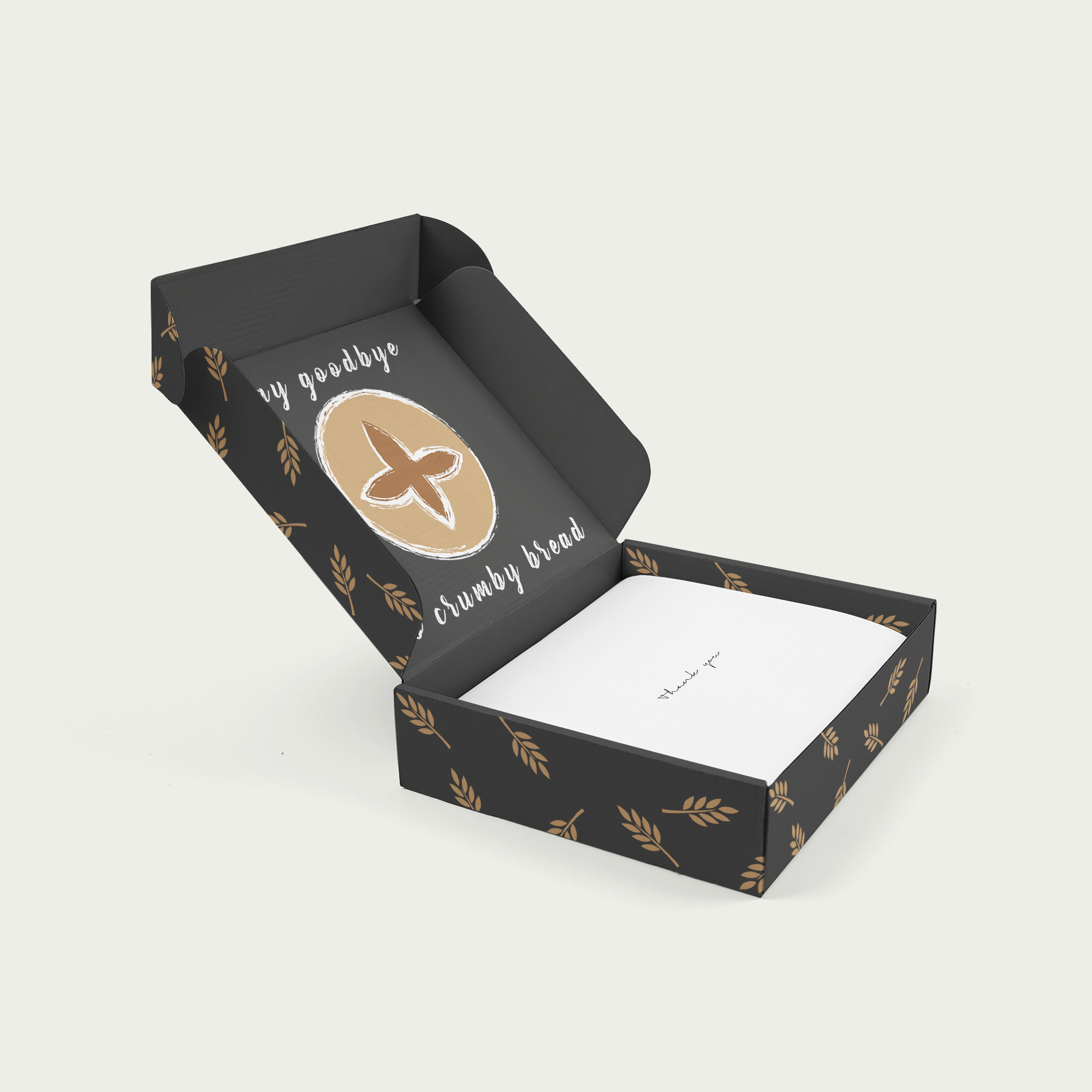
While I initially thought the natural cardboard color would be a huge component of adding to the natural-ness of the box, changing the background to black helped everything finally come together! Likewise, the green stalks needed to be turned brown to really show what the products is all about. The brand now has a more sophisticated look!
Inside, the kit says "say goodbye to crumby bread," keeping in spirit with the punniness of the brand name.
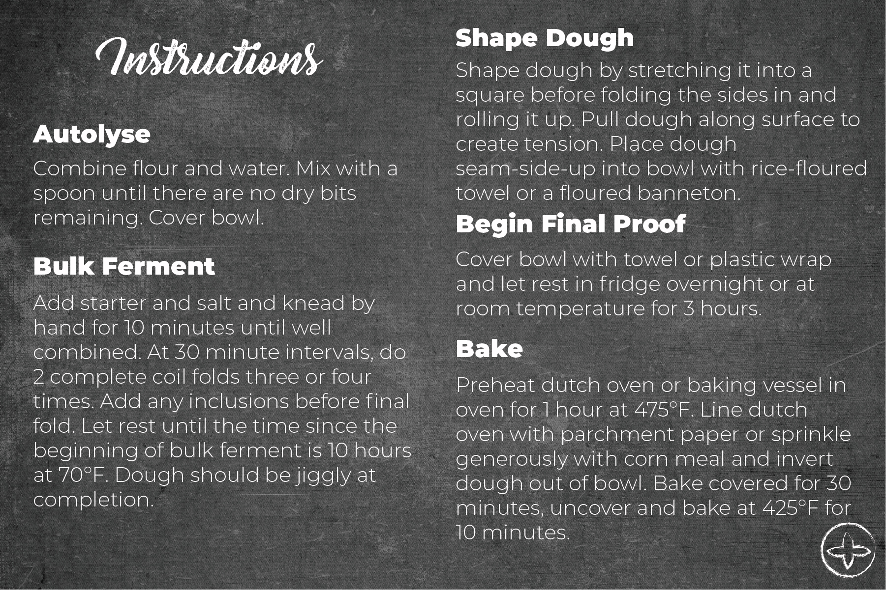
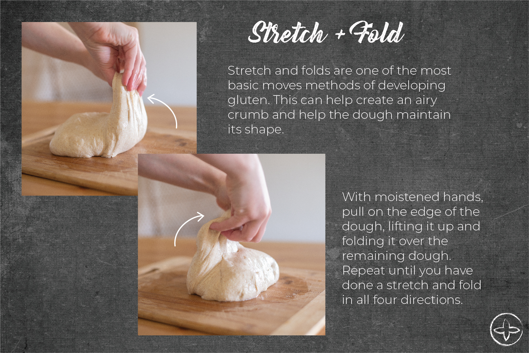
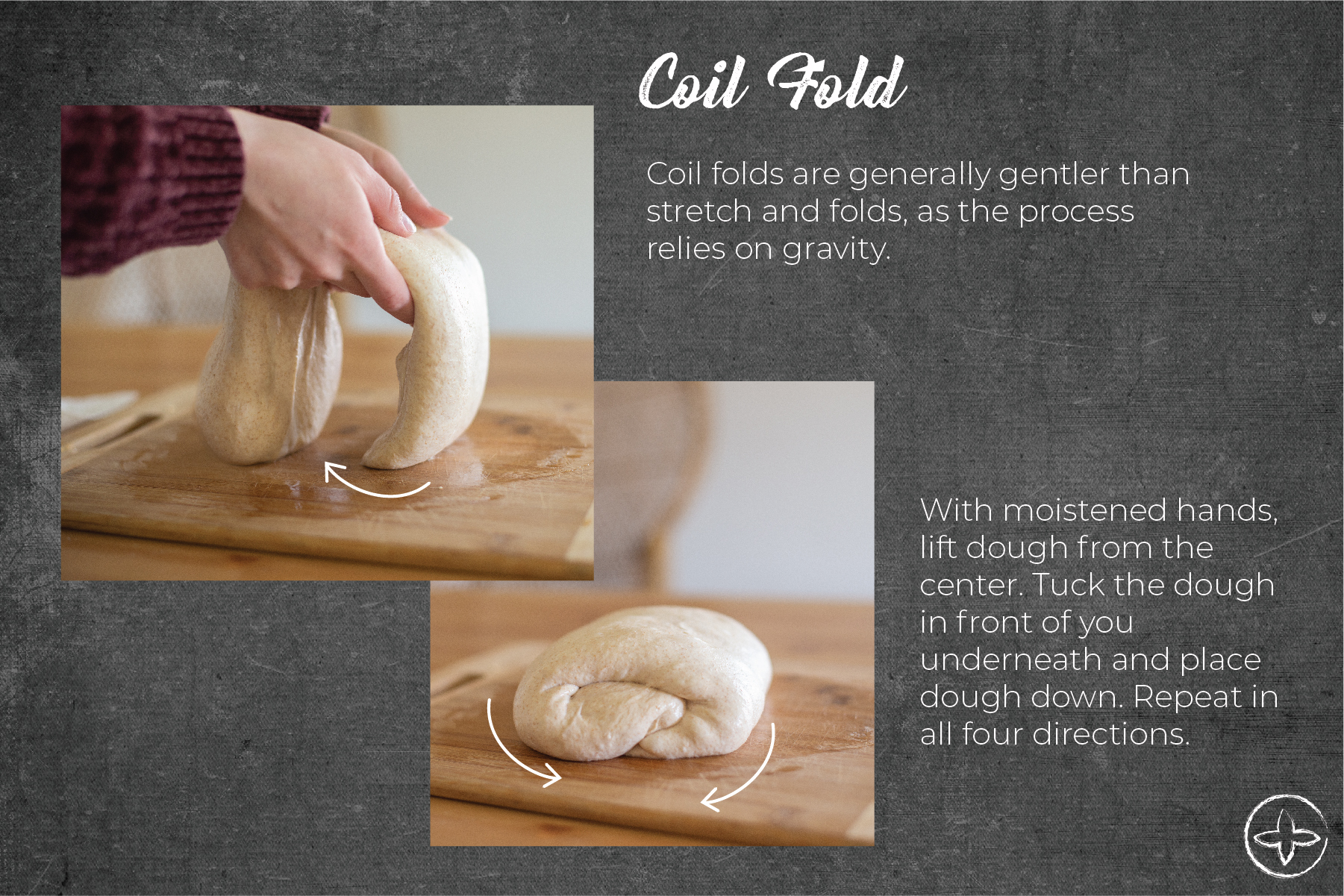
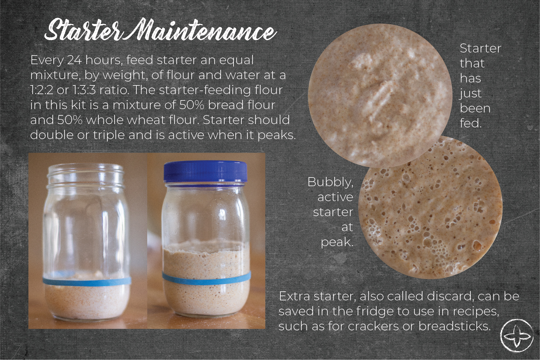
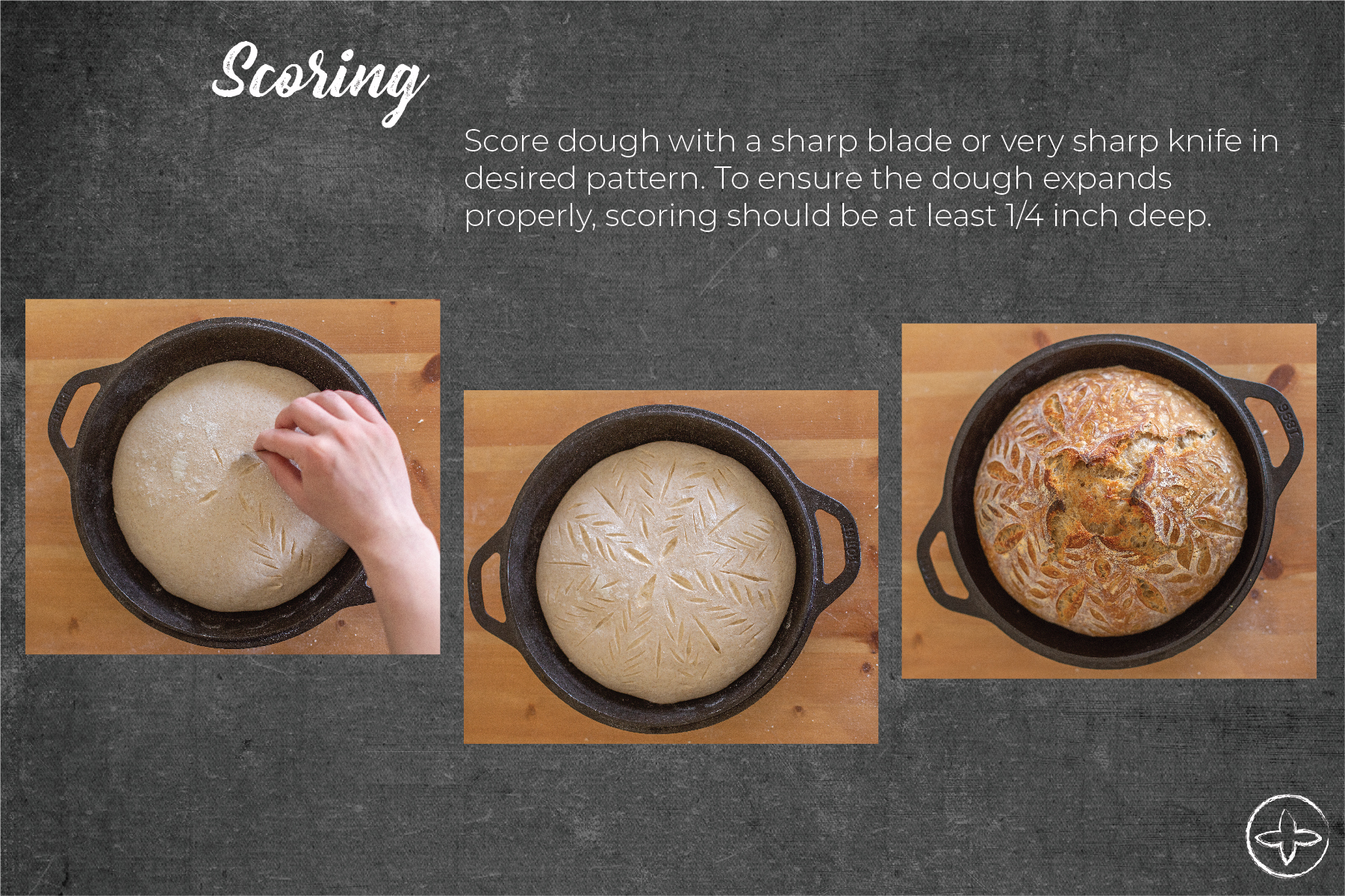
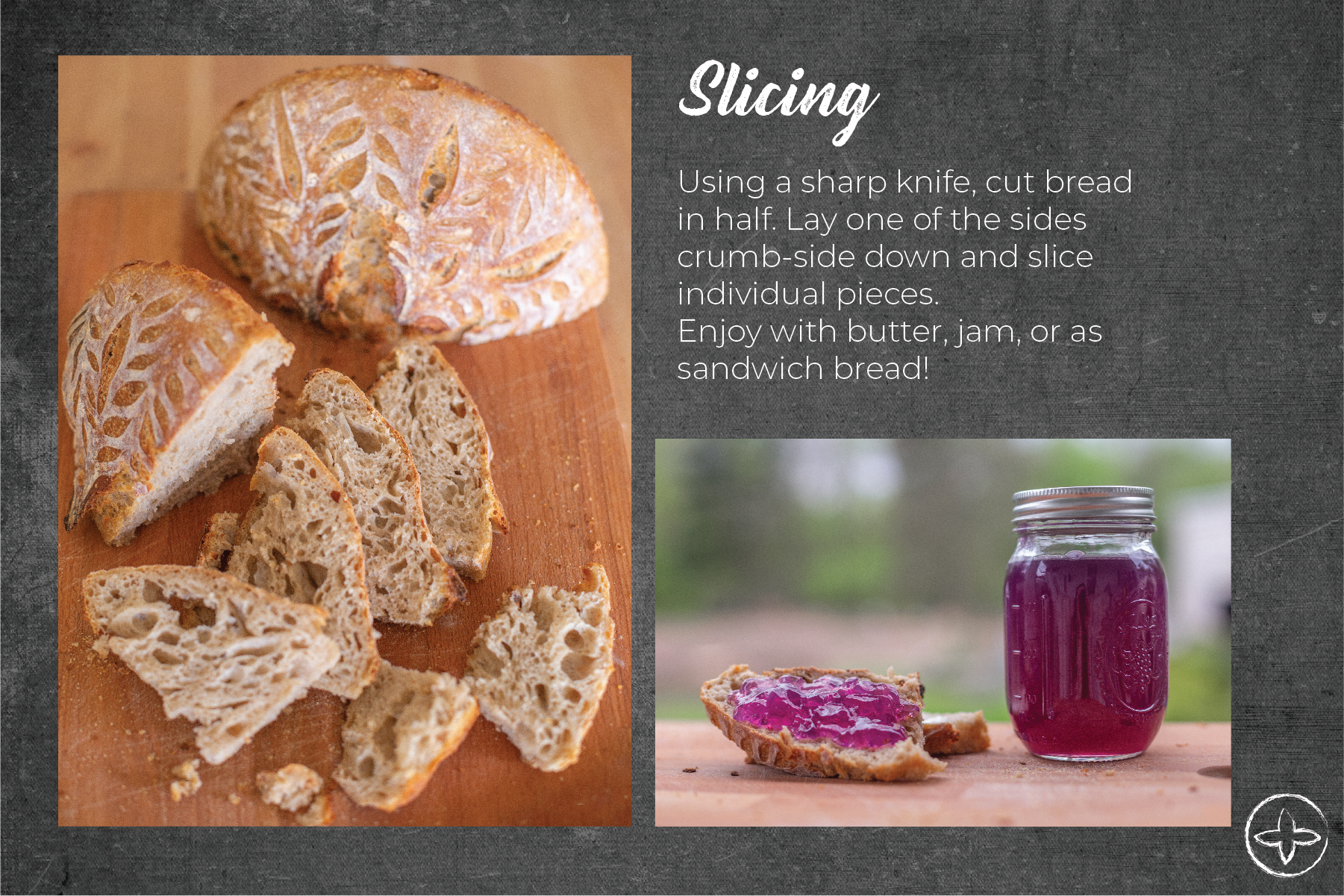
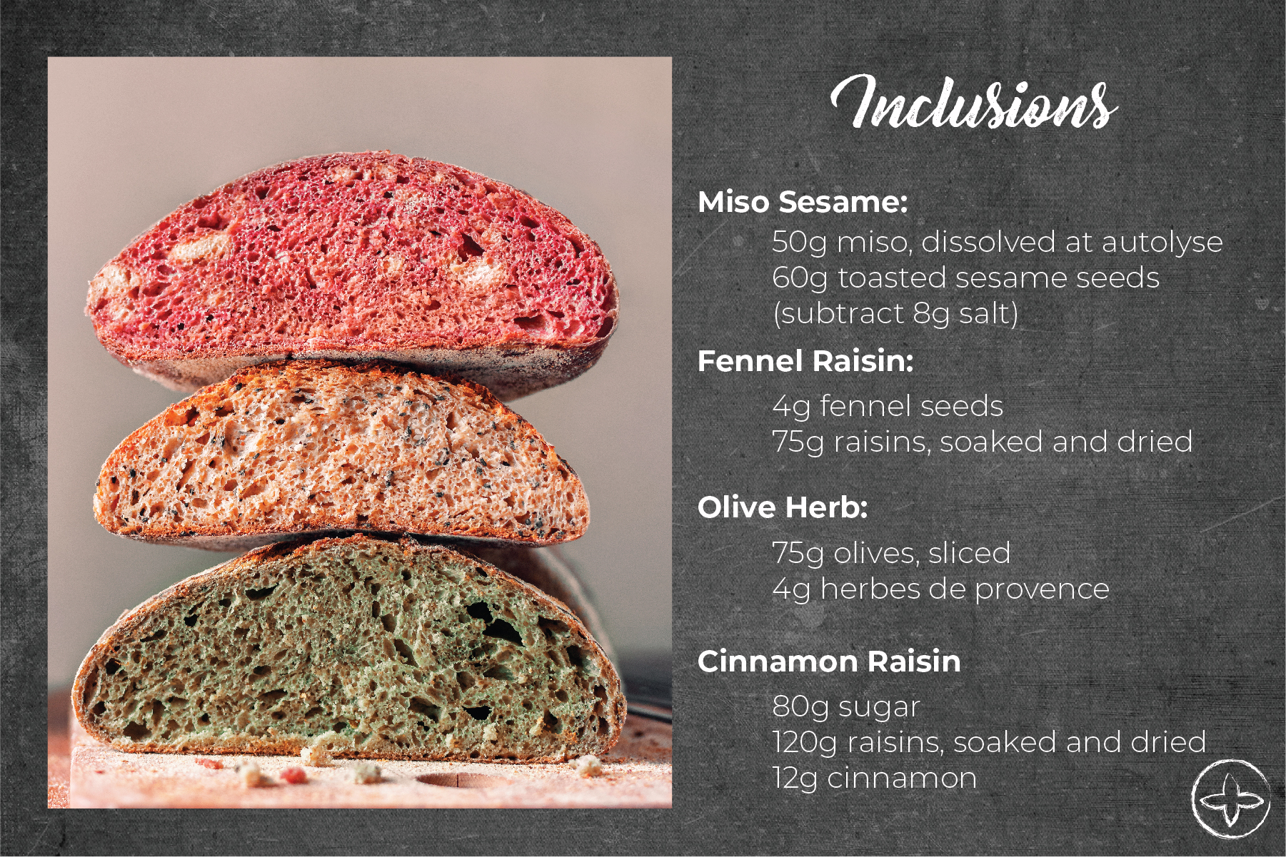
My cards featured instructions that lead the consumer step-by-step through the process of creating sourdough from start-to-finish. Therefore, it was important for me to create a visual guide. While illustrations could have worked, photography has the added benefit of a person knowing exactly how the dough should really appear at certain points.


Since the cards are only 4x6 inches and often have multiple photographs, it was important to keep the photographs visually simple and clear. Arrows and instructions help aid the consumer in ensuring they're making the correct movements.


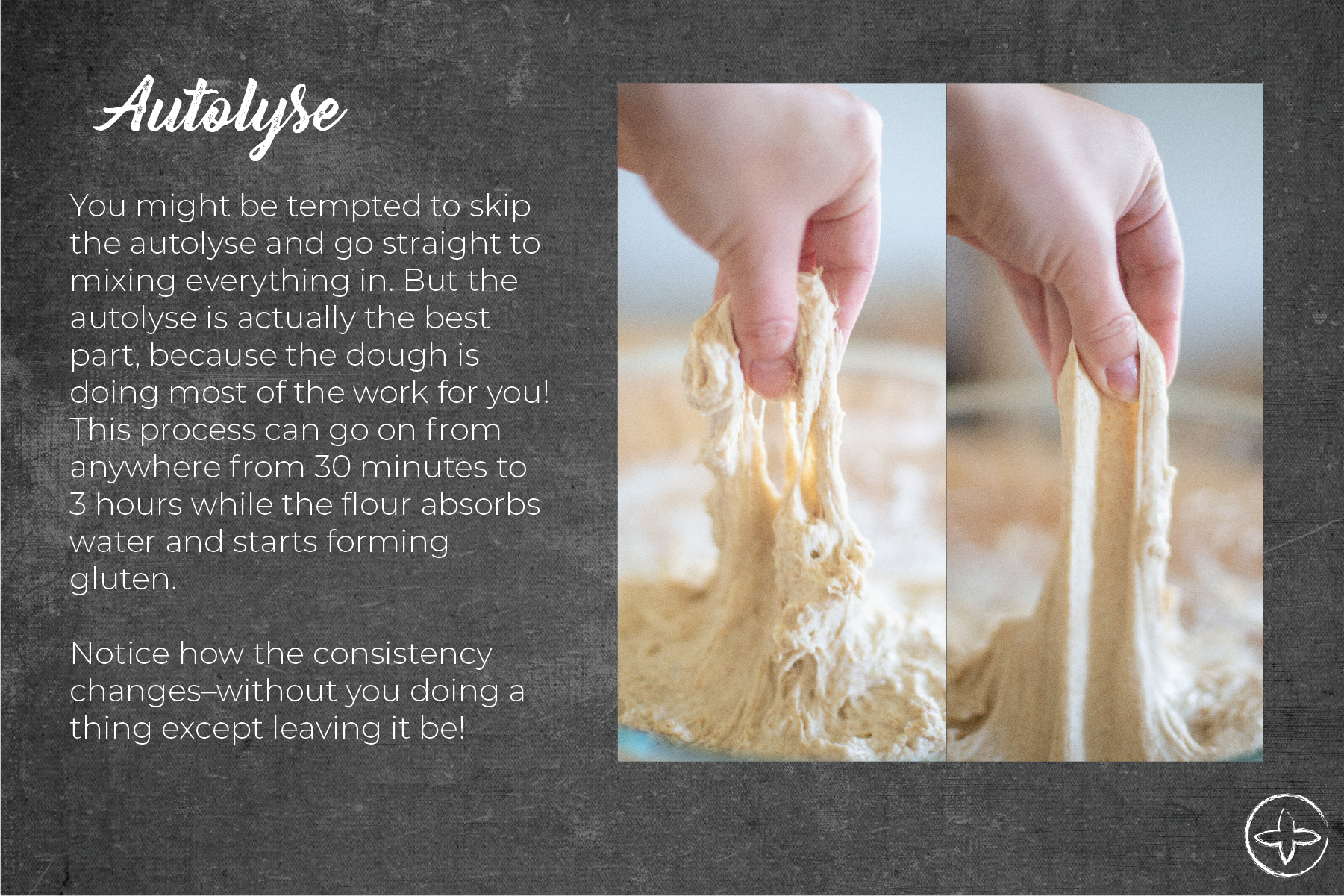
Some parts of the process, like demonstrating extensibility of the dough before and after autolyse are far easier to explain the importance of visually. An illustration could have helped, but consumers might not believe the difference until it's put side-by-side. From my own personal experience, I know the autolyse makes a huge difference in workability–but even I was surprised at the visual results.
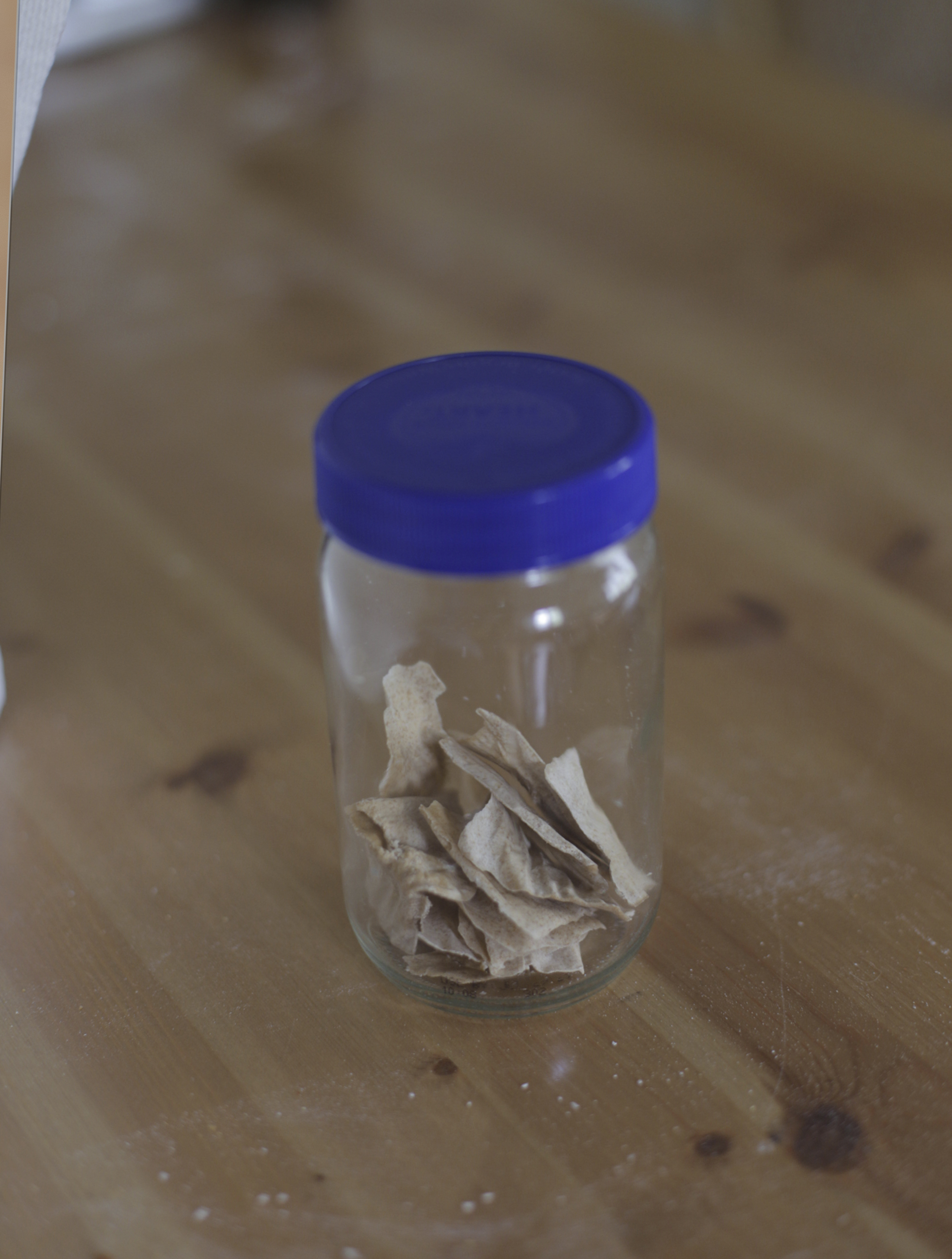
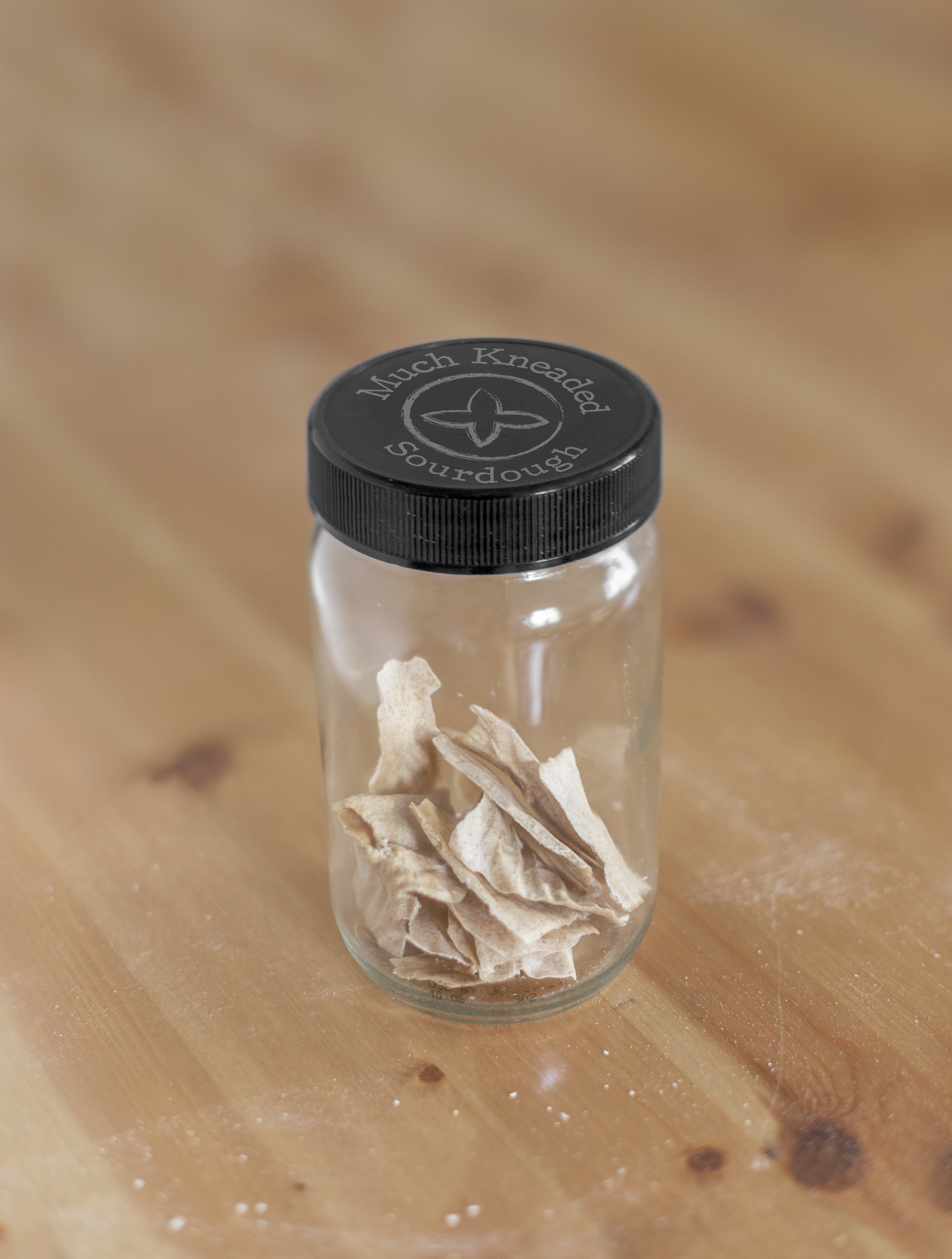
While jar mockups exist on the web, I wanted to create a mockup of a simple jar that has real dried sourdough starter inside. Using an old Follow Your Heart Vegenaise jar, I transformed this photo into something that fits my brand.
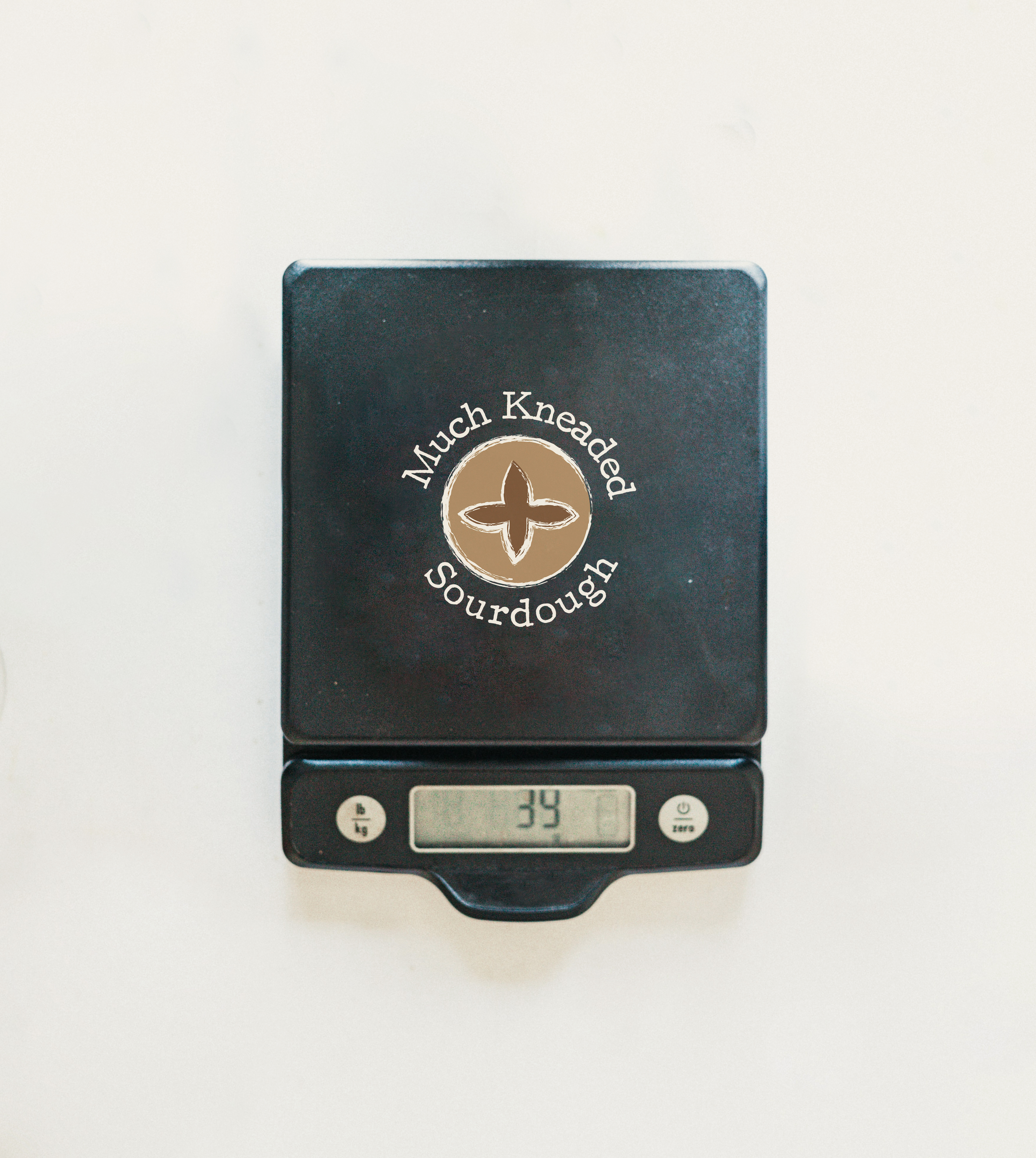
The only food scale I have at home is silver–which doesn't really match the vibe I was going for. Instead, I opted to use Photoshop to clean up a photo of a scale I found on Unsplash. The coffee beans and plants were digitally removed and my logo placed in the center of the design.